
Babyloop
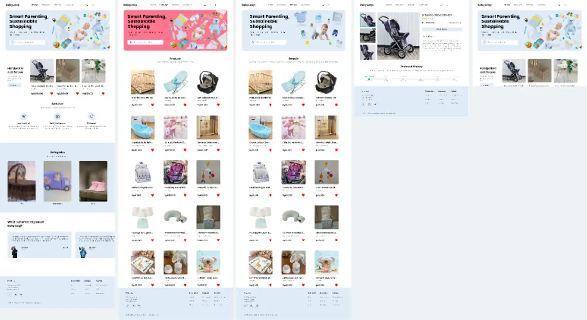
A marketplace concept for pre-owned baby goods — a landing page, a product catalog, and a product page that shows each item’s pre-owned history before a parent buys.
Background
Baby gear is used for only a short stretch, so much of it is still in good condition when a family no longer needs it. Buying second-hand is cheaper and keeps usable products out of waste, but a parent still has to trust the item: who used it, how long, and whether it was checked. Babyloop treats that history as part of the product itself instead of leaving it to a chat message between seller and buyer.
Process
Landing page
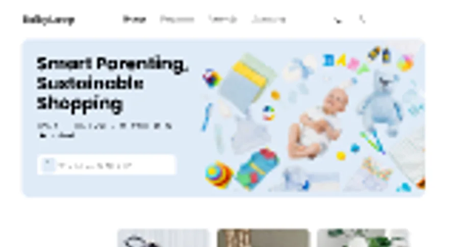
Set a soft, calm tone with the headline “Smart Parenting, Sustainable Shopping.” The page leads with a search bar, follows with best sellers, three trust points, three category cards, and customer testimonials, and closes with a full footer.
Catalog
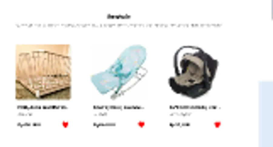
Designed a three-column product grid where every card carries a photo, name, price, and wishlist heart, with a category and sort bar above it. The hero band was explored in two colors — light blue and pink — as variants of the same page.
Product page
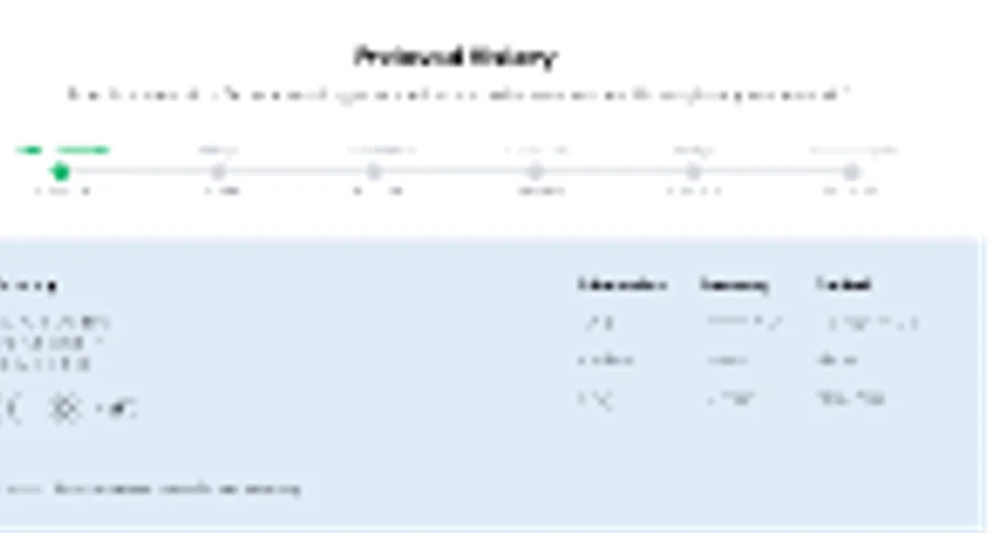
The detail page pairs a thumbnail gallery with the product name, rating, price, and add-to-cart action, then a description. Below that, a “Preowned History” timeline walks through the item’s previous owners and checks, so its condition is visible before checkout.
Gallery
Key Features
Search-first landing page
The hero gives search the most room, so a parent can look for a specific item before browsing categories or best sellers.
Pre-owned history timeline
Each product page shows a timeline of its past owners and condition checks, turning a second-hand listing into a verifiable record rather than a claim.
Wishlist on every card
A heart on each product card lets a shopper collect items while browsing the grid without opening each one.
Category browsing
Three illustrated category cards — cribs, toys, and shoes — sit on the landing page as a shortcut into the catalog.
Trust points and testimonials
An about section pairs three icon-led promises with customer quotes, answering the hesitation that comes with buying used baby products.
Two hero variants
The same catalog was designed with a light blue and a pink hero band, giving the brand two directions to choose from without rebuilding the page.
The Figma file holds five desktop artboards: the landing page, two color variants of the catalog, the product detail page, and a shorter crop of the landing page. Together they cover the path from first visit to product page, with the pre-owned history as the concept that ties sustainability to trust.